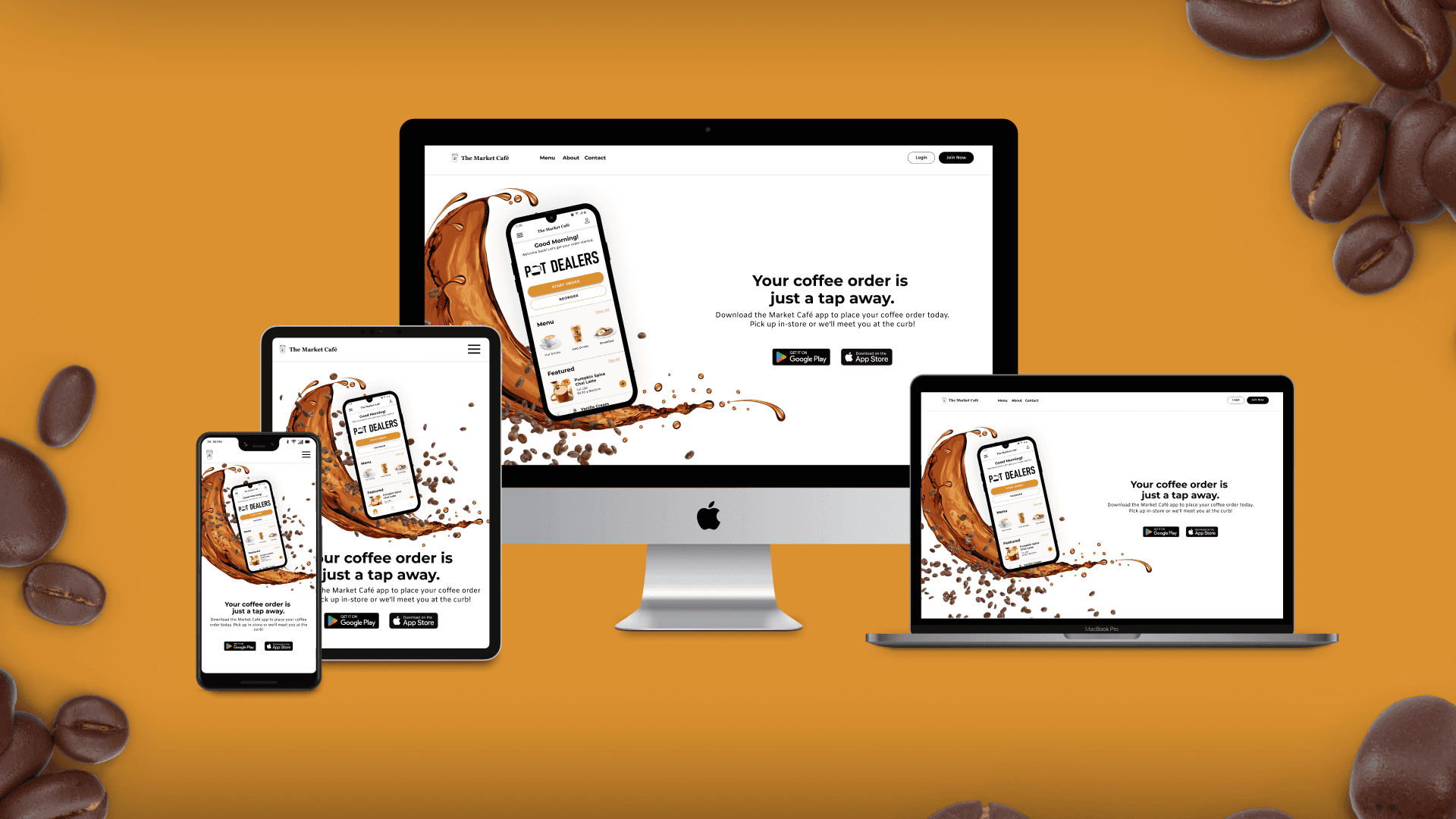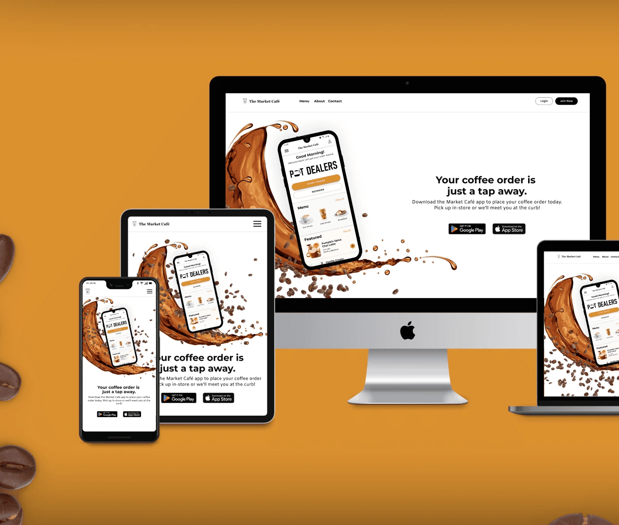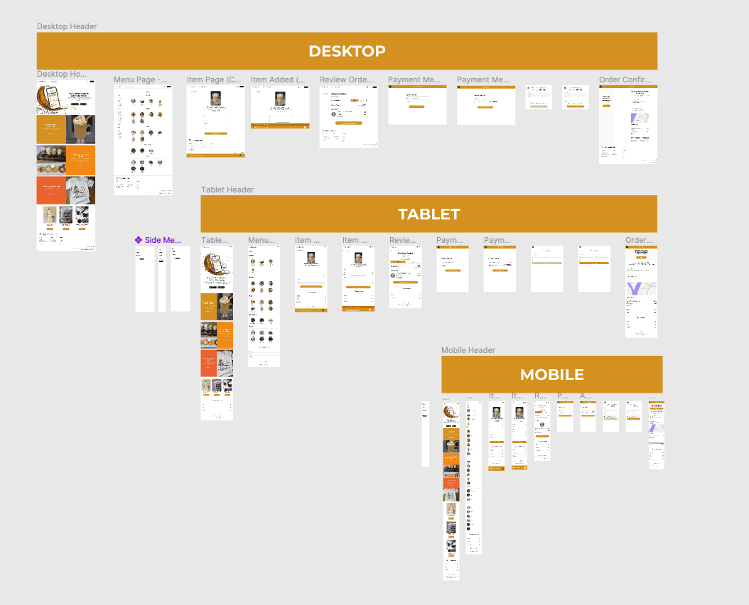
Continuity in Branding: Upholding the established logo, branding, and typography from the mobile app, the website maintains the visual identity, ensuring a cohesive and recognizable Market Café brand.
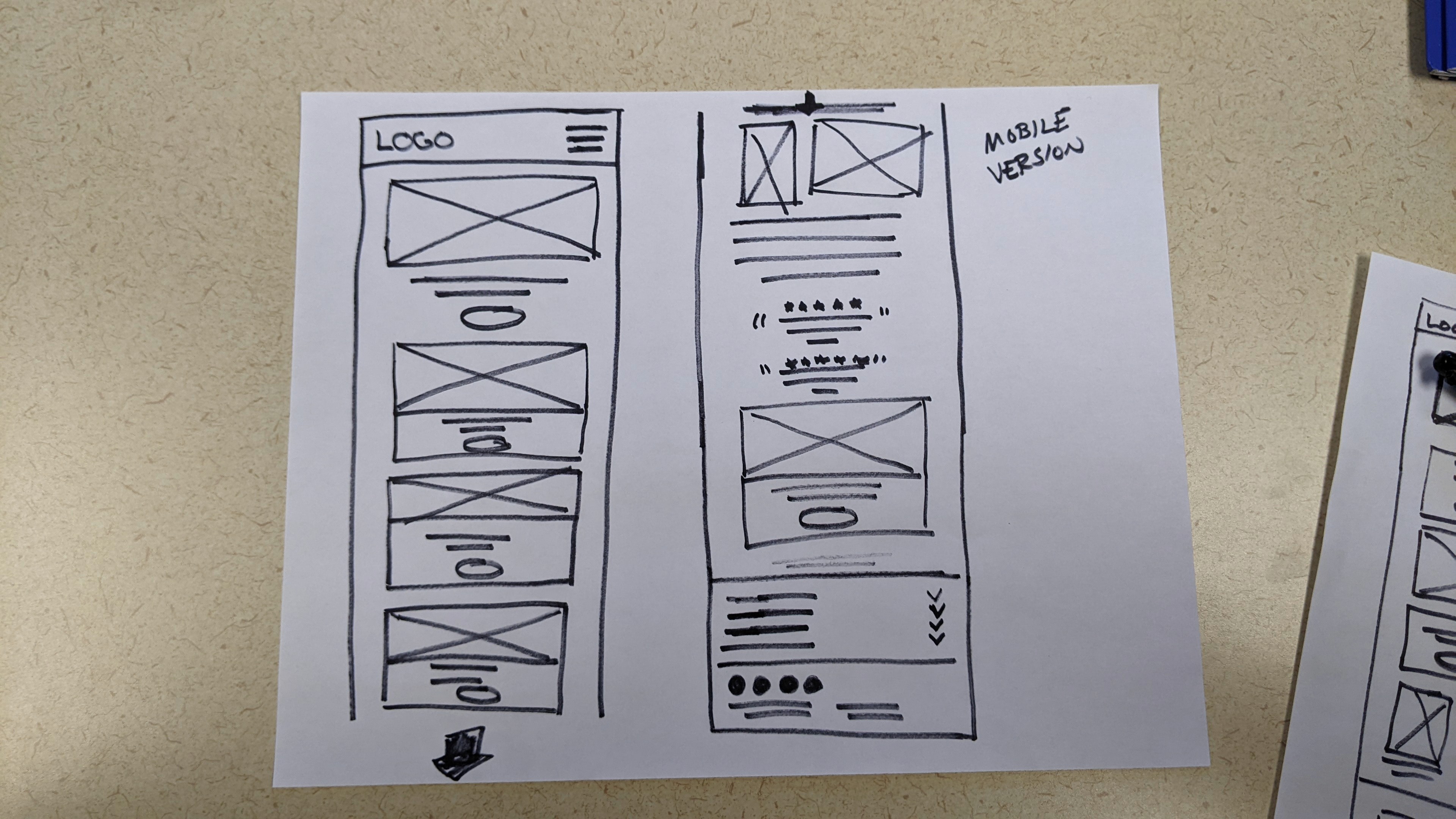
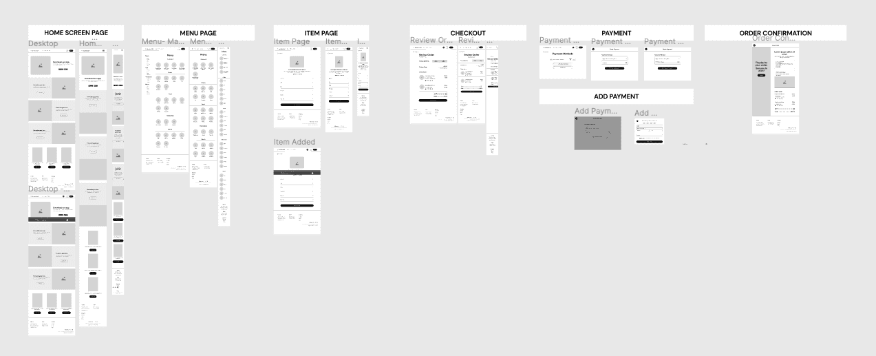
Adaptable Layouts: The core challenge lies in crafting layouts that transcend device boundaries. From tablets to smartphones and desktops, the responsive design ensures optimal functionality and user experience across various screen sizes.
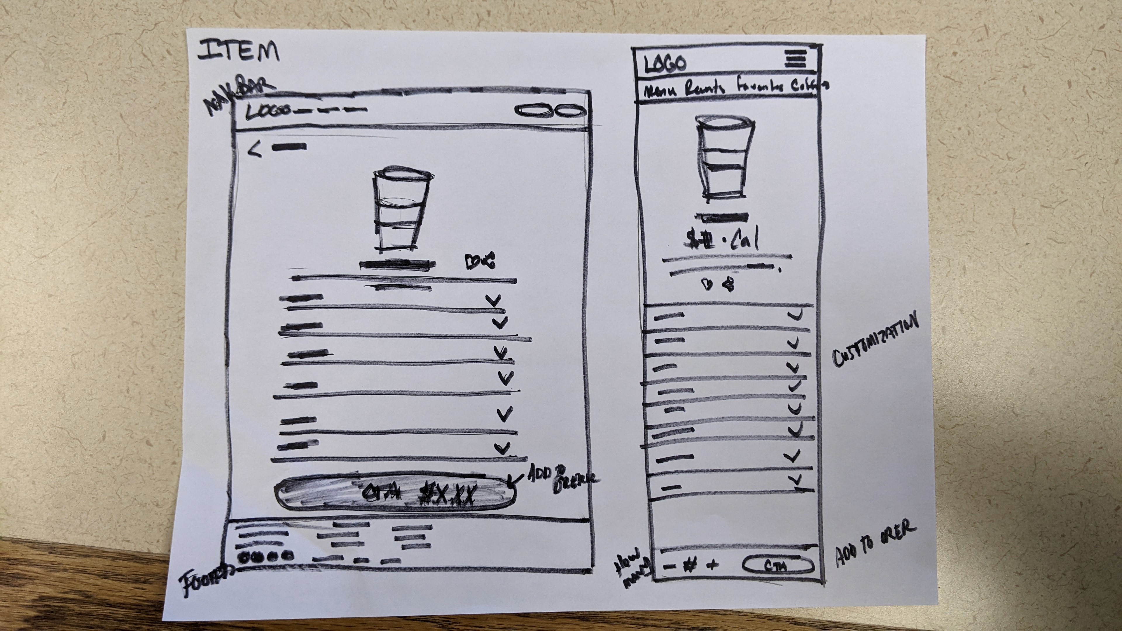
Fluid Navigation: While the mobile app prioritized a compact and intuitive navigation, the website's expanded canvas demands a reevaluation. Striking the right balance between simplicity and depth, the navigation system guides users seamlessly through the Market Café online experience.
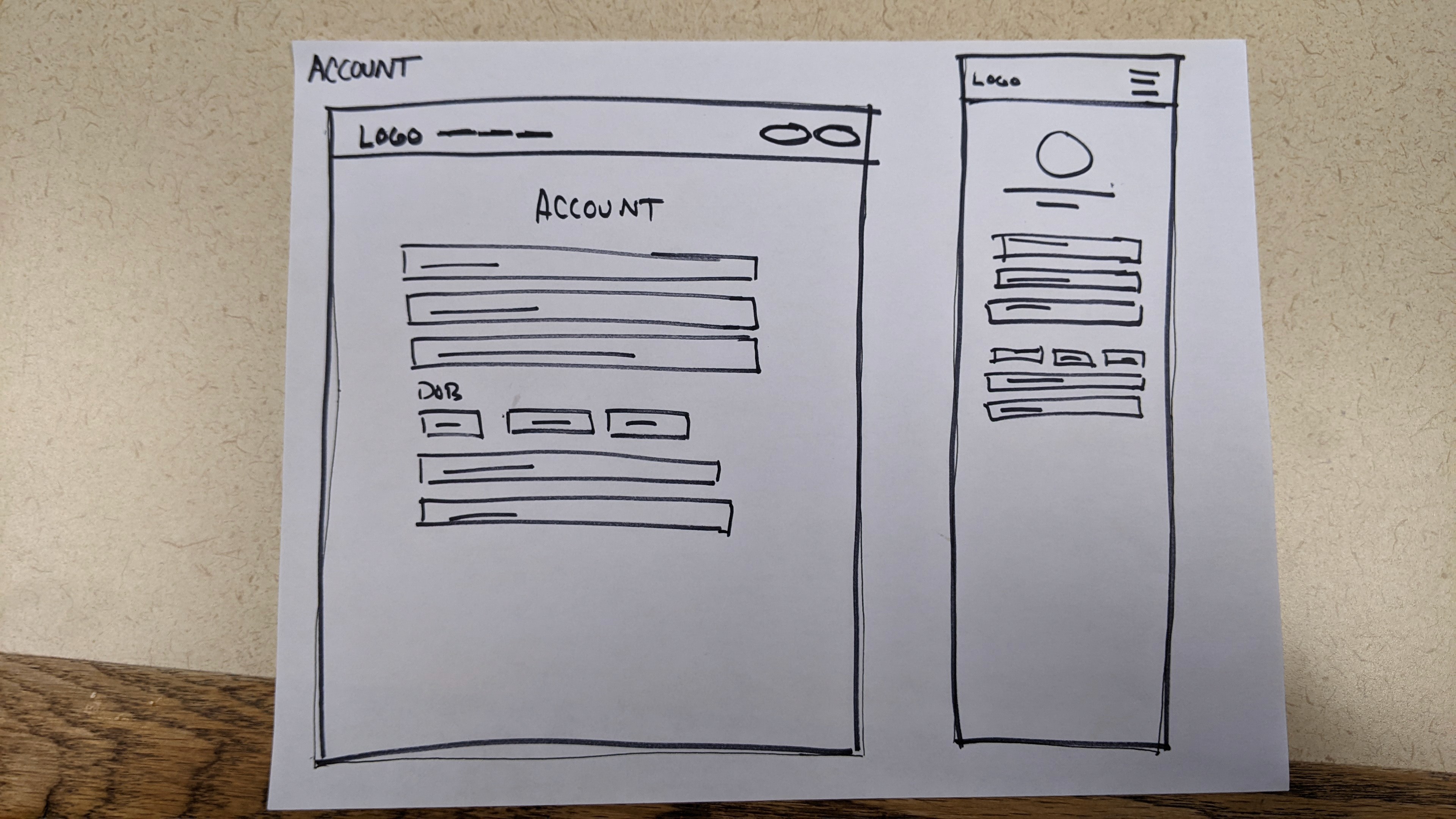
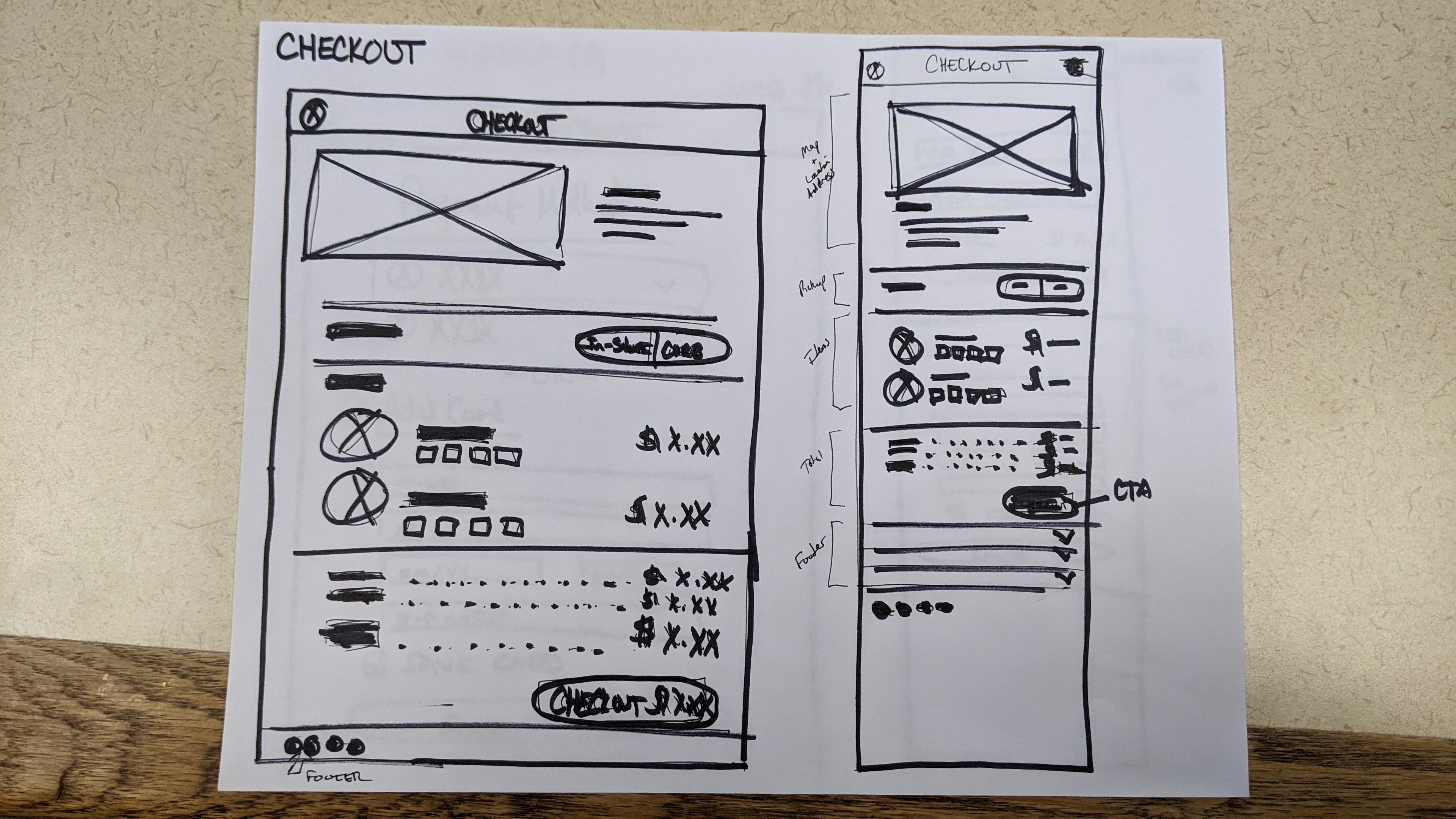
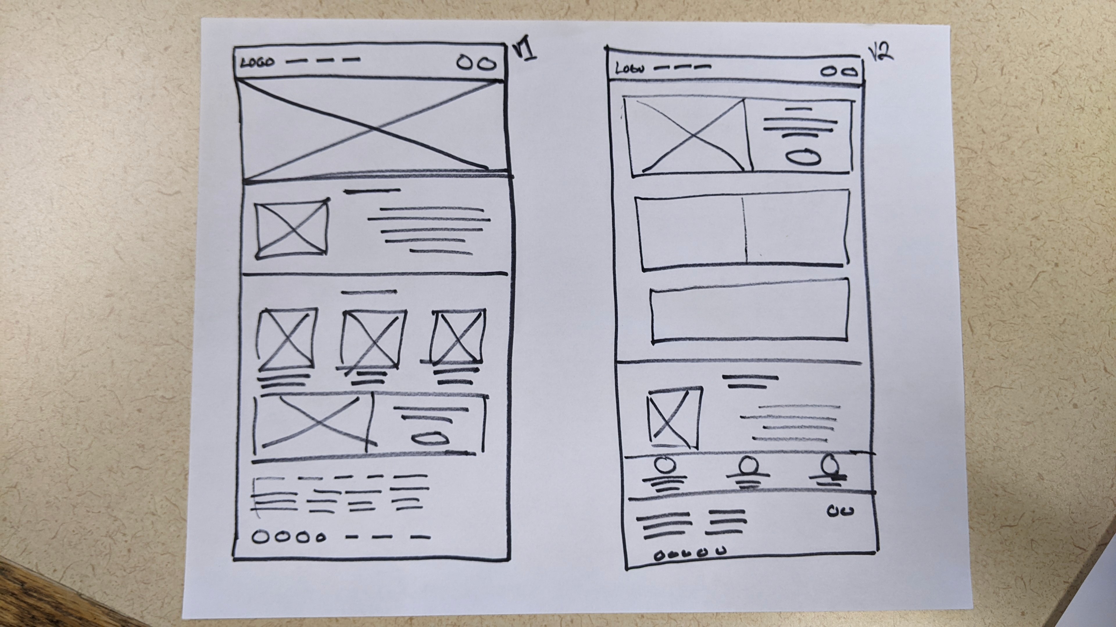
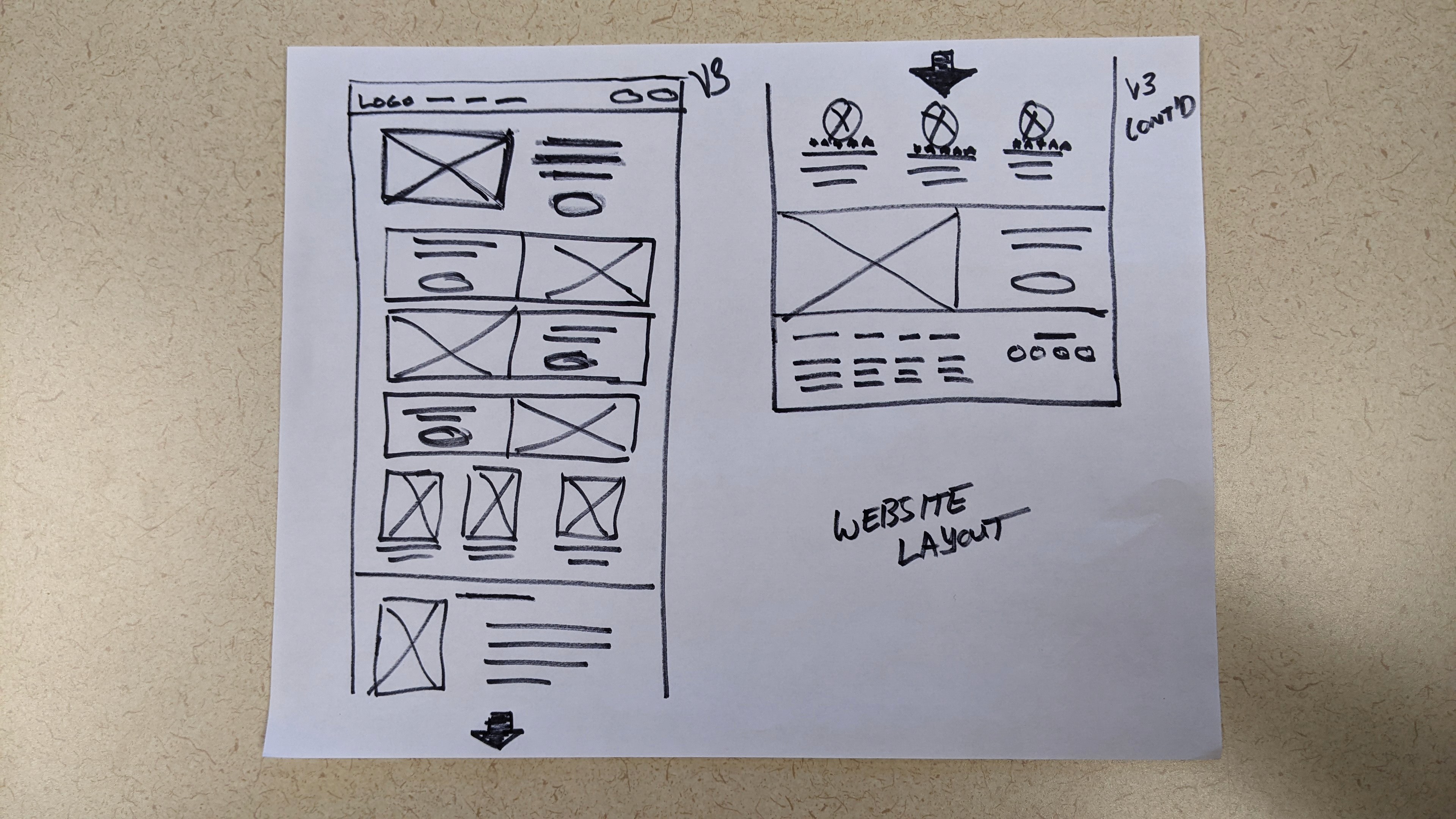
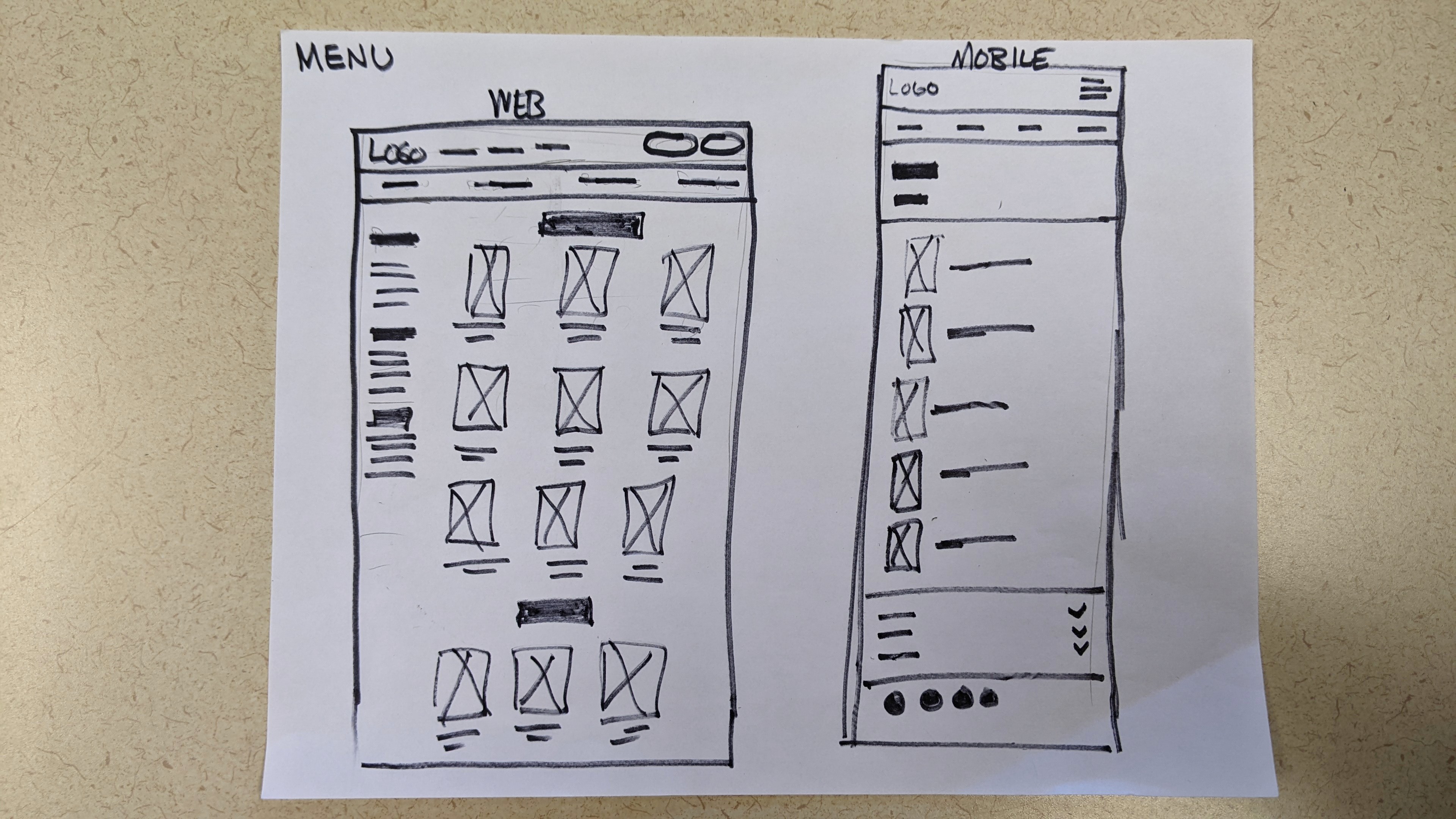
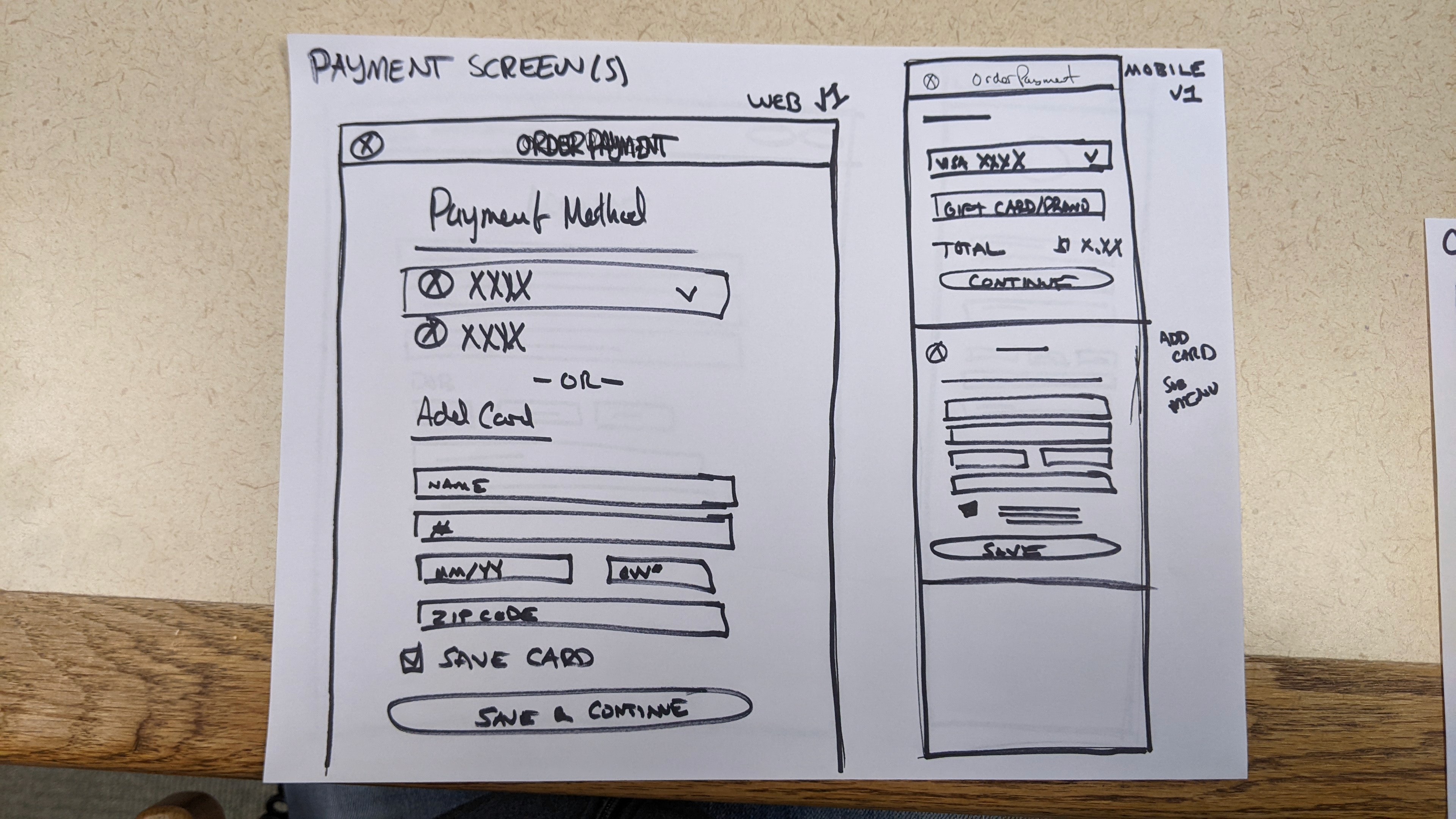
PAPER WIREFRAMES
Ensuring a visually appealing and functional design across multiple devices requires a nuanced understanding of responsive design principles. This involved reverse engineering design aspects from bigger brands and incorporating those elements without appearing derivative while also maintaining brand consistency.
