
PROJECT OVERVIEW
PROJECT OVERVIEW
PROJECT OVERVIEW
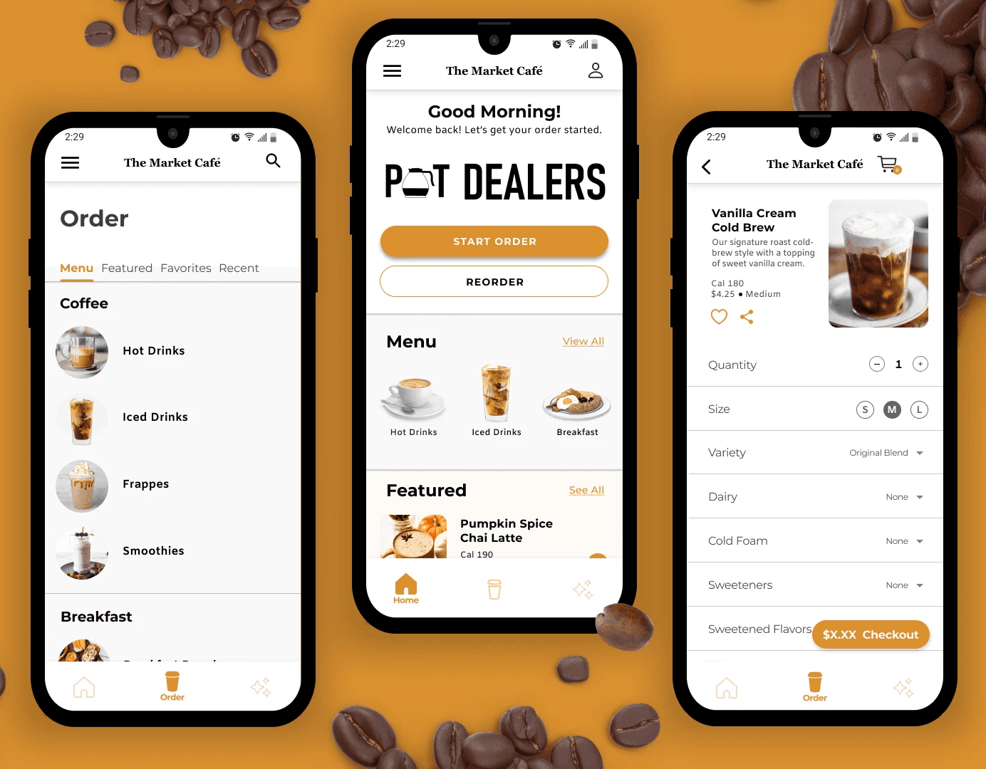
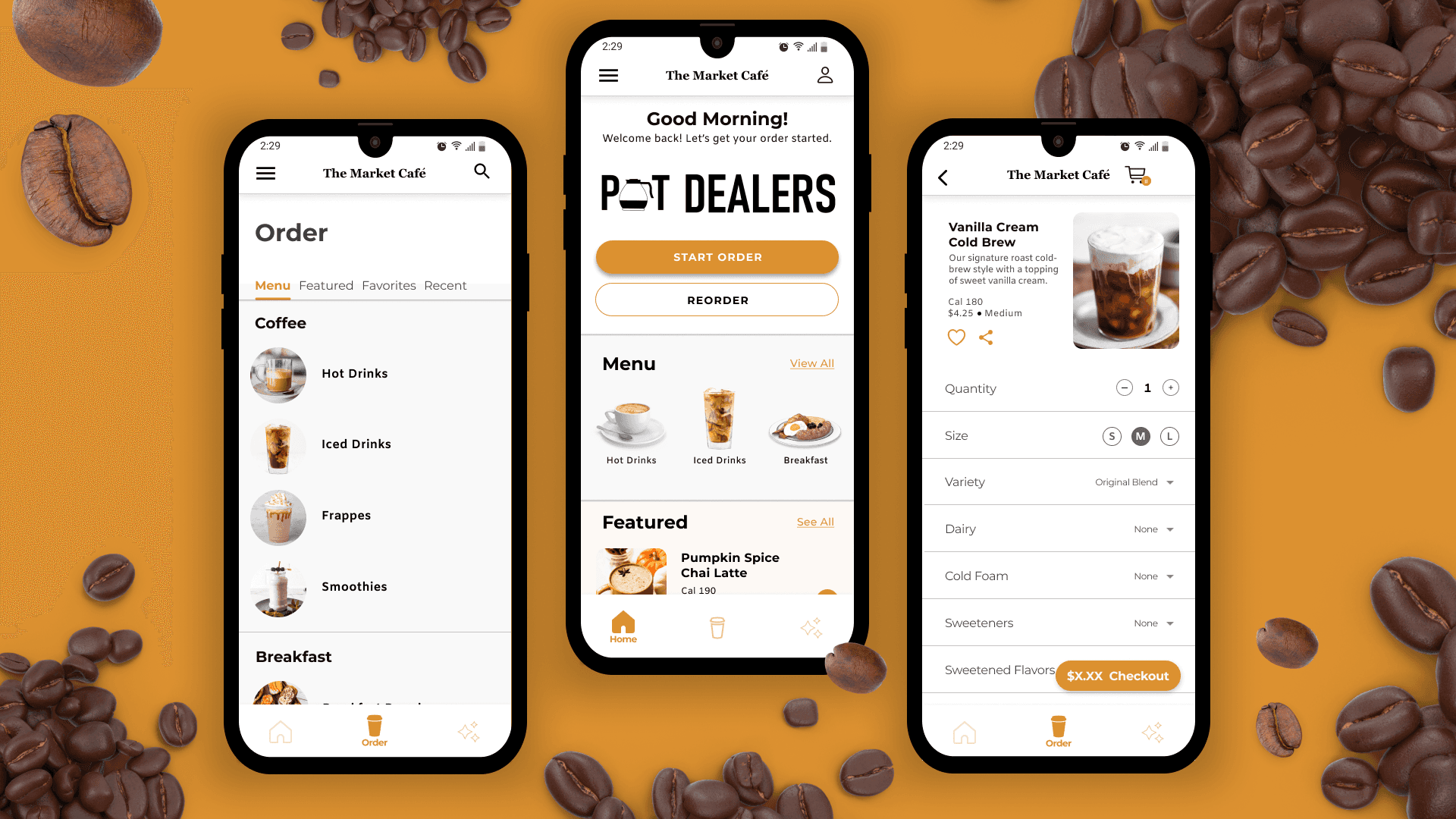
As part of the Google UI/UX Design certificate program, my first project was to design the major features of a mobile application from start to finish. I was given a prompt and from there chose a local business that satisfied the project requirements. In the end, I chose the Market Café, a local coffeehouse based in Wheeling, WV. Despite its smaller scale, the Market Café offers a diverse range of high-quality food and beverage options and has a small, but dedicated customer base.
As part of the Google UI/UX Design certificate program, my first project was to design the major features of a mobile application from start to finish. I was given a prompt and from there chose a local business that satisfied the project requirements. In the end, I chose the Market Café, a local coffeehouse based in Wheeling, WV. Despite its smaller scale, the Market Café offers a diverse range of high-quality food and beverage options and has a small, but dedicated customer base.
As part of the Google UI/UX Design certificate program, my first project was to design the major features of a mobile application from start to finish. I was given a prompt and from there chose a local business that satisfied the project requirements. In the end, I chose the Market Café, a local coffeehouse based in Wheeling, WV. Despite its smaller scale, the Market Café offers a diverse range of high-quality food and beverage options and has a small, but dedicated customer base.
Problem
Problem
Problem
While The Market Café provides a great product, a cozy atmosphere, and exceptional service, they suffer from a lack of brand identity. Additionally, their online presence is severely lacking as they only have a Facebook business page and Instagram profile, but no official website or mobile application.
While The Market Café provides a great product, a cozy atmosphere, and exceptional service, they suffer from a lack of brand identity. Additionally, their online presence is severely lacking as they only have a Facebook business page and Instagram profile, but no official website or mobile application.
While The Market Café provides a great product, a cozy atmosphere, and exceptional service, they suffer from a lack of brand identity. Additionally, their online presence is severely lacking as they only have a Facebook business page and Instagram profile, but no official website or mobile application.

SOLUTION
SOLUTION
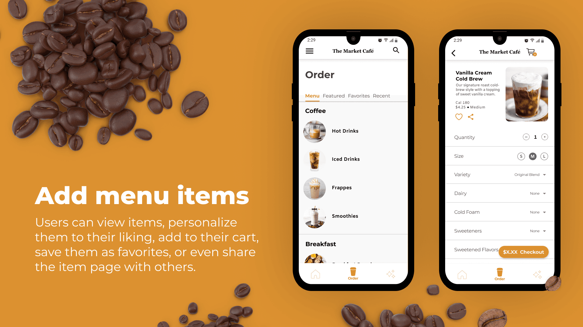
“Create a mobile ordering app for on-the-go customers that’s practical and easy to use.”
“Create a mobile ordering app for on-the-go customers that’s practical and easy to use.”
“Create a mobile ordering app for on-the-go customers that’s practical and easy to use.”
PRODUCT FEATURES
PRODUCT FEATURES
PRODUCT FEATURES




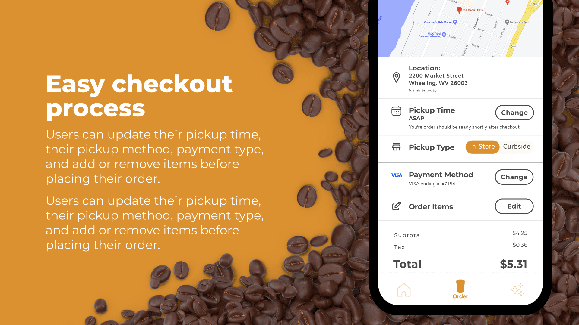


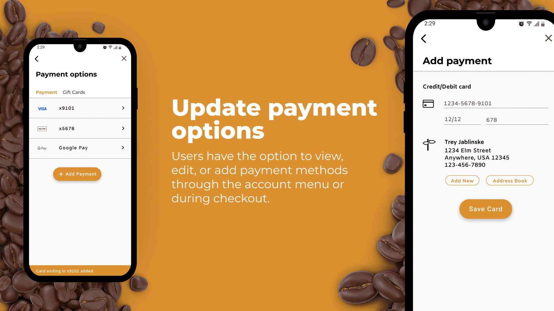


PROCESS
PROCESS
PROCESS
The development of the Market Café app commenced with an in-depth analysis of the cafe's target demographic to better understand user's wants, needs, and expectations.
The development of the Market Café app commenced with an in-depth analysis of the cafe's target demographic to better understand user's wants, needs, and expectations.
The development of the Market Café app commenced with an in-depth analysis of the cafe's target demographic to better understand user's wants, needs, and expectations.
User Personas
User Personas
User Personas
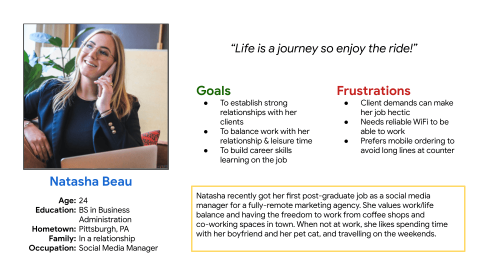
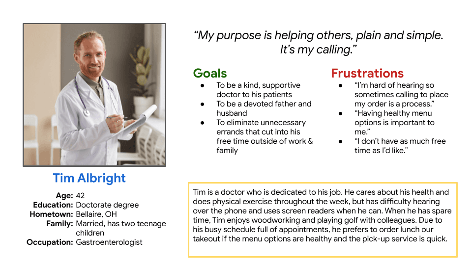
Conducting user research was extremely important for identifying the target audience for our cafe application. Demographics such as age, income, education, career, etc. were used in this process to decipher the two most common user personas likely to order and pay for online services.
Conducting user research was extremely important for identifying the target audience for our cafe application. Demographics such as age, income, education, career, etc. were used in this process to decipher the two most common user personas likely to order and pay for online services.
Conducting user research was extremely important for identifying the target audience for our cafe application. Demographics such as age, income, education, career, etc. were used in this process to decipher the two most common user personas likely to order and pay for online services.
Persona 1
Persona 1
Persona 1


persona 2
persona 2
persona 2


Flow Chart
Flow Chart
Flow Chart
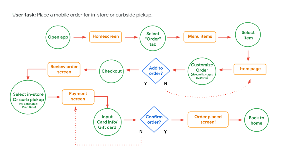
Finally, a user flow chart was created to figure out the navigational steps the user will actually need to take within the app to place a mobile order.
Finally, a user flow chart was created to figure out the navigational steps the user will actually need to take within the app to place a mobile order.
Finally, a user flow chart was created to figure out the navigational steps the user will actually need to take within the app to place a mobile order.


USER JOURNEY
USER JOURNEY
USER JOURNEY
I created the user journey on paper using storyboards, split into two parts: the "top-down" view and the “close-up” view of the user view of the user journey.
I created the user journey on paper using storyboards, split into two parts: the "top-down" view and the “close-up” view of the user view of the user journey.
I created the user journey on paper using storyboards, split into two parts: the "top-down" view and the “close-up” view of the user view of the user journey.


The top-down view depicts the user's journey from an overarching perspective. In this example, one of our user's, Tim, needs to quickly order coffee on the go or else he'll be late to the office. Since he has the Market Café app downloaded to his phone, he can quickly order his favorite beverage (a Brown Sugar Cinnamon Iced Latté with two short of espressos) via the mobile app and have it ready for pick-up without missing his 9:00 am team meeting.
The top-down view depicts the user's journey from an overarching perspective. In this example, one of our user's, Tim, needs to quickly order coffee on the go or else he'll be late to the office. Since he has the Market Café app downloaded to his phone, he can quickly order his favorite beverage (a Brown Sugar Cinnamon Iced Latté with two short of espressos) via the mobile app and have it ready for pick-up without missing his 9:00 am team meeting.
The top-down view depicts the user's journey from an overarching perspective. In this example, one of our user's, Tim, needs to quickly order coffee on the go or else he'll be late to the office. Since he has the Market Café app downloaded to his phone, he can quickly order his favorite beverage (a Brown Sugar Cinnamon Iced Latté with two short of espressos) via the mobile app and have it ready for pick-up without missing his 9:00 am team meeting.
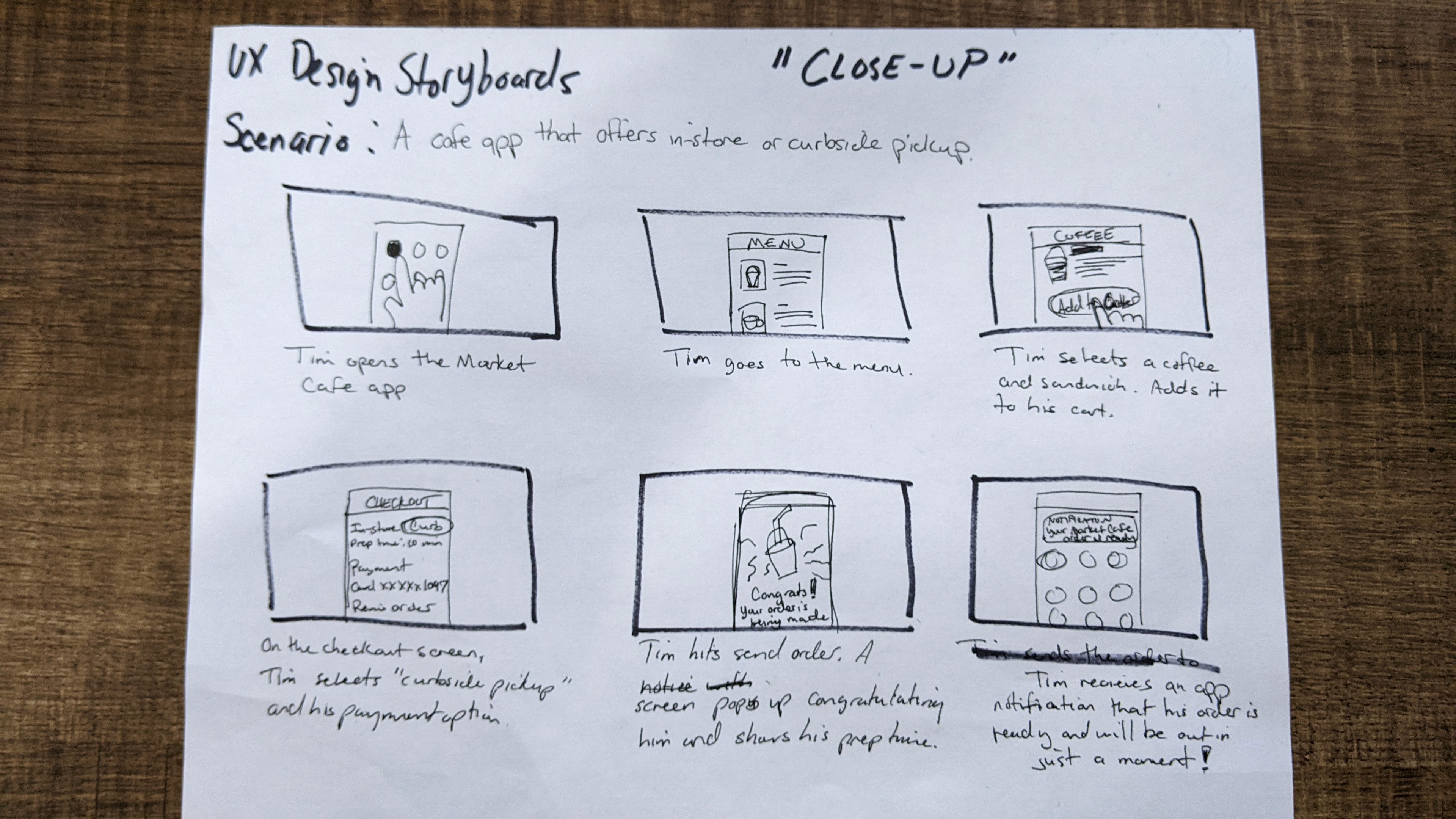


In the "close-up" view, we see what's ACTUALLY going on as he pulls up the app, scrolls through the menu, finds his favorite drink, adds it to his car, submits his payment and viola! — his order is processed and will be ready shortly.
In the "close-up" view, we see what's ACTUALLY going on as he pulls up the app, scrolls through the menu, finds his favorite drink, adds it to his car, submits his payment and viola! — his order is processed and will be ready shortly.
In the "close-up" view, we see what's ACTUALLY going on as he pulls up the app, scrolls through the menu, finds his favorite drink, adds it to his car, submits his payment and viola! — his order is processed and will be ready shortly.
PAPER WIREFRAMES
PAPER WIREFRAMES
PAPER WIREFRAMES
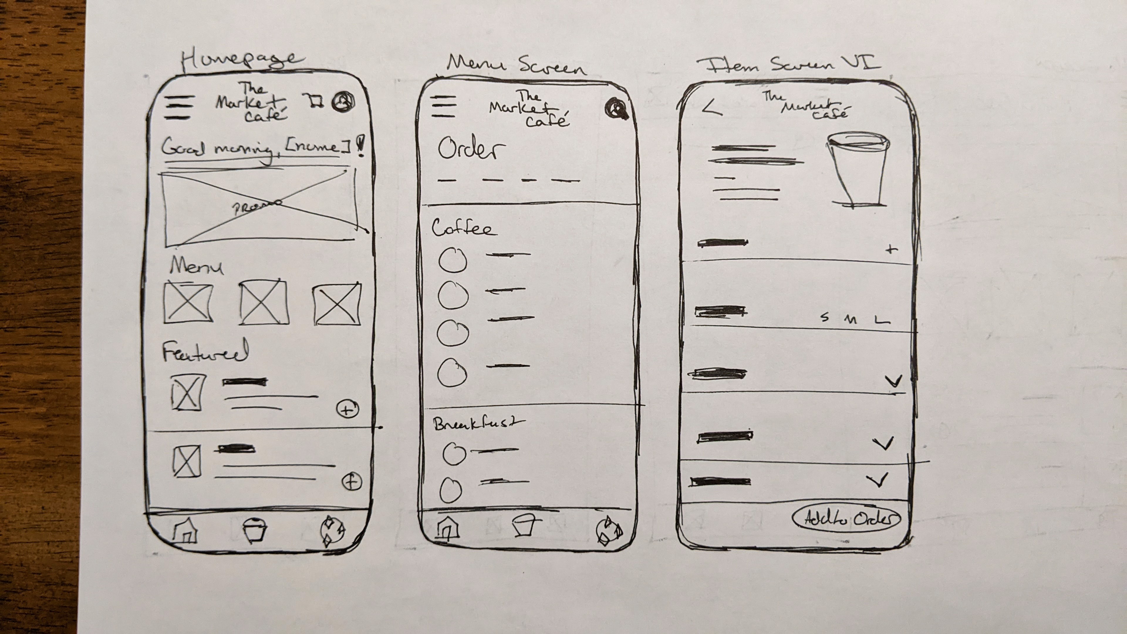
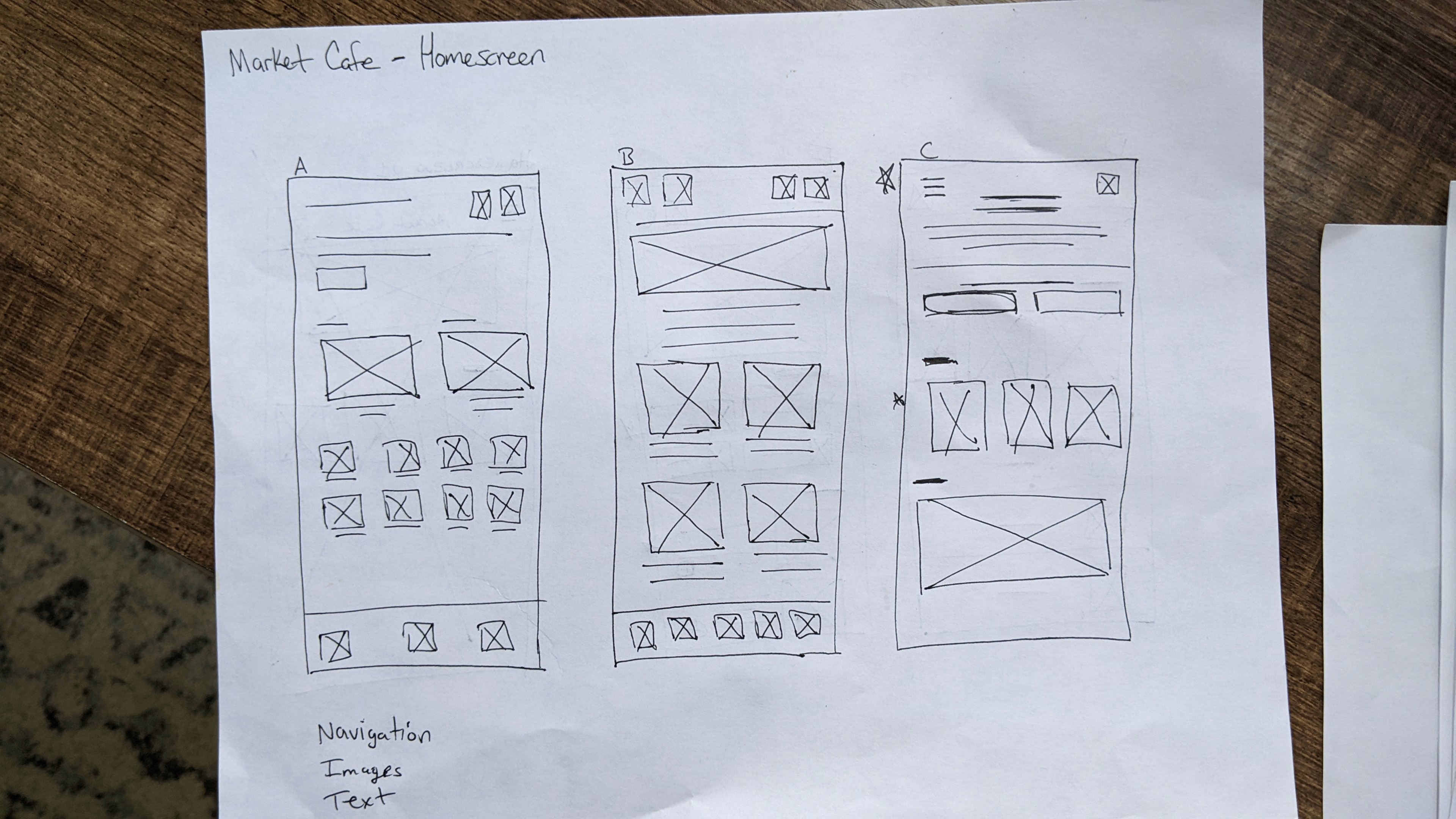
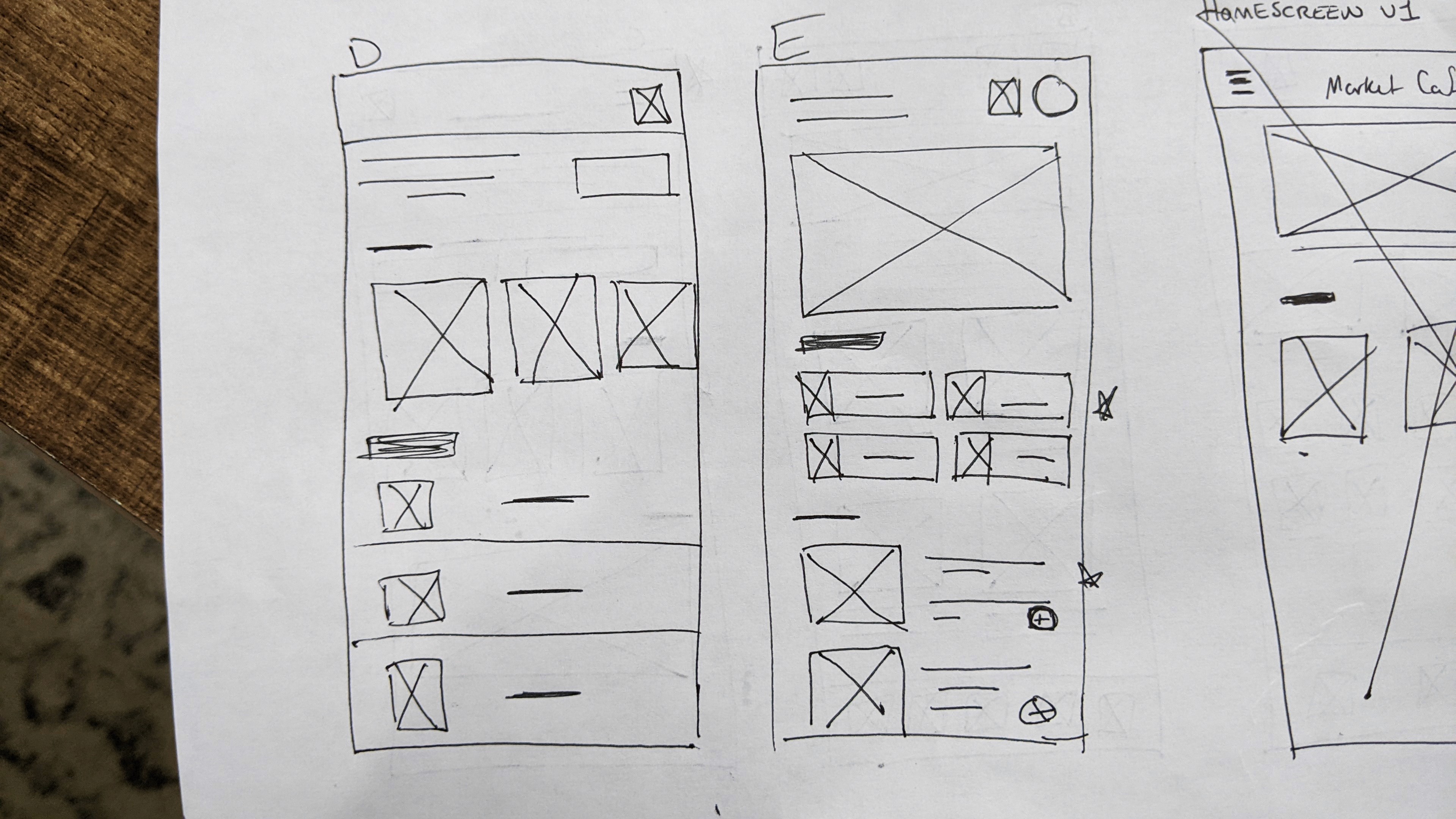
Subsequently, drawing the initial sketches of the mobile screens on paper provided a quick and easy way to test different layouts before moving to digital wireframes in Figma.
Subsequently, drawing the initial sketches of the mobile screens on paper provided a quick and easy way to test different layouts before moving to digital wireframes in Figma.
Subsequently, drawing the initial sketches of the mobile screens on paper provided a quick and easy way to test different layouts before moving to digital wireframes in Figma.






DIGITAL PROTOTYPES
DIGITAL PROTOTYPES
DIGITAL PROTOTYPES
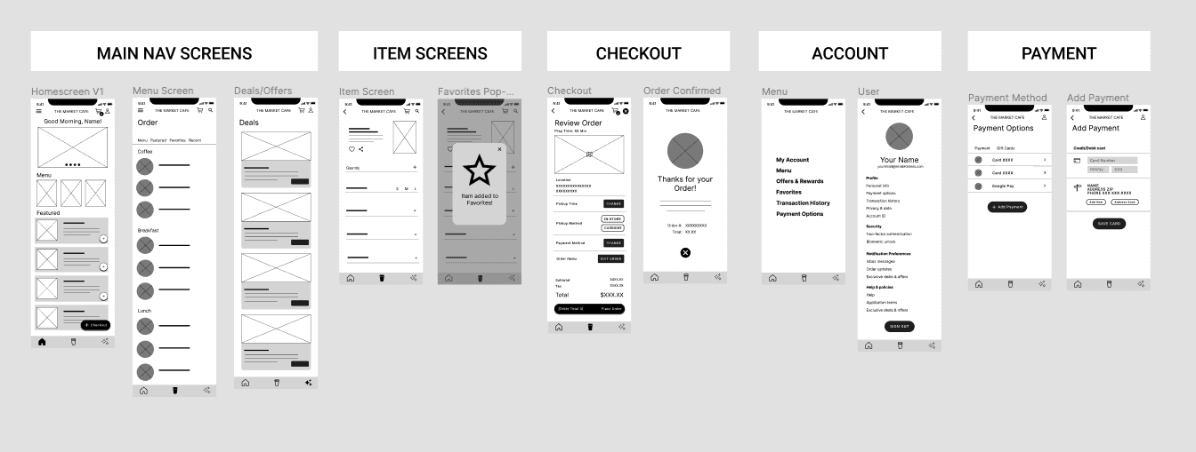
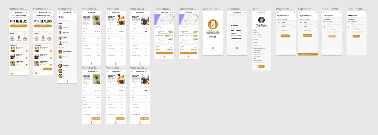
Next, a lo-fi prototype was created and the first round of usability testing was conducted (see next section). The wireframe prototypes were tweaked based on feedback before I proceeded with creating mockups incorporating the desired brand colors, logos, typography, menu items, etc.
Next, a lo-fi prototype was created and the first round of usability testing was conducted (see next section). The wireframe prototypes were tweaked based on feedback before I proceeded with creating mockups incorporating the desired brand colors, logos, typography, menu items, etc.
Next, a lo-fi prototype was created and the first round of usability testing was conducted (see next section). The wireframe prototypes were tweaked based on feedback before I proceeded with creating mockups incorporating the desired brand colors, logos, typography, menu items, etc.
LO-FI PROTOTYPE


MOCKUP V2
MOCKUPS
MOCKUPS


Usability Study
Usability Study
Usability Study
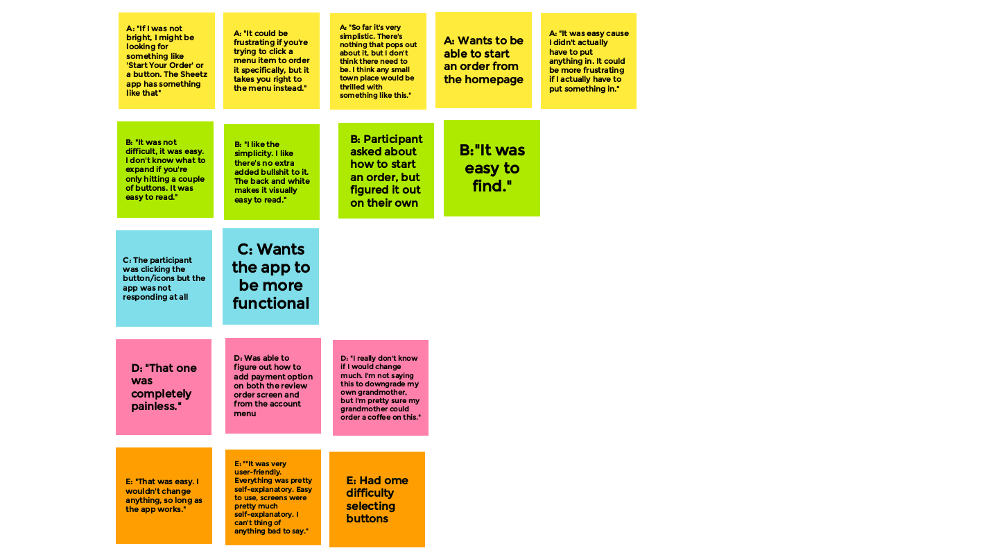
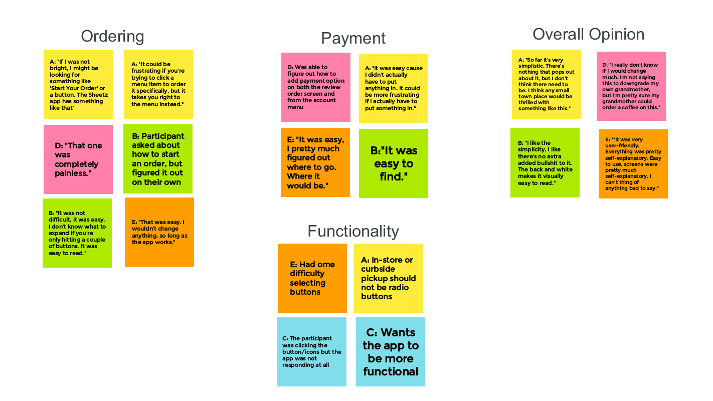
We asked five people who closely matched the ideal user personas to participate in a usability study. We posed five open-ended questions in two rounds: one with the lo-fi prototype and another with the high-fidelity prototype. The responses collected from these rounds proved instrumental in refining elements of the app design, leading to improved overall navigation and accessibility. Provided below is an affinity diagram categorizing recurring themes and critiques of the app based on the findings from the first usability study.
We asked five people who closely matched the ideal user personas to participate in a usability study. We posed five open-ended questions in two rounds: one with the lo-fi prototype and another with the high-fidelity prototype. The responses collected from these rounds proved instrumental in refining elements of the app design, leading to improved overall navigation and accessibility. Provided below is an affinity diagram categorizing recurring themes and critiques of the app based on the findings from the first usability study.
We asked five people who closely matched the ideal user personas to participate in a usability study. We posed five open-ended questions in two rounds: one with the lo-fi prototype and another with the high-fidelity prototype. The responses collected from these rounds proved instrumental in refining elements of the app design, leading to improved overall navigation and accessibility. Provided below is an affinity diagram categorizing recurring themes and critiques of the app based on the findings from the first usability study.
AFFINITY DIAGRAMS
AFFINITY DIAGRAMS
AFFINITY DIAGRAMS


Conducting user research was extremely important for identifying the target audience for our cafe application, based on demographics such as income, education, career, etc. This process included creating a goal statement, outlining the user journey, user personas, and finally the intended user flow for navigating the app and submitting an order.
Conducting user research was extremely important for identifying the target audience for our cafe application, based on demographics such as income, education, career, etc. This process included creating a goal statement, outlining the user journey, user personas, and finally the intended user flow for navigating the app and submitting an order.
Conducting user research was extremely important for identifying the target audience for our cafe application, based on demographics such as income, education, career, etc. This process included creating a goal statement, outlining the user journey, user personas, and finally the intended user flow for navigating the app and submitting an order.


Conducting user research was extremely important for identifying the target audience for our cafe application, based on demographics such as income, education, career, etc. This process included creating a goal statement, outlining the user journey, user personas, and finally the intended user flow for navigating the app and submitting an order.
Conducting user research was extremely important for identifying the target audience for our cafe application, based on demographics such as income, education, career, etc. This process included creating a goal statement, outlining the user journey, user personas, and finally the intended user flow for navigating the app and submitting an order.
Conducting user research was extremely important for identifying the target audience for our cafe application, based on demographics such as income, education, career, etc. This process included creating a goal statement, outlining the user journey, user personas, and finally the intended user flow for navigating the app and submitting an order.
Iterations
Iterations
Iterations
Following the first usability study, the next step was to modify or create pages or elements based on feedback. Fortunately, a majority of users faced no challenges in completing tasks; however, valuable opinions were provided to enhance the design's user-friendliness. The implementation of these changes took place during the second iteration of wireframes.
Following the first usability study, the next step was to modify or create pages or elements based on feedback. Fortunately, a majority of users faced no challenges in completing tasks; however, valuable opinions were provided to enhance the design's user-friendliness. The implementation of these changes took place during the second iteration of wireframes.
Following the first usability study, the next step was to modify or create pages or elements based on feedback. Fortunately, a majority of users faced no challenges in completing tasks; however, valuable opinions were provided to enhance the design's user-friendliness. The implementation of these changes took place during the second iteration of wireframes.
Iteration #1: Start order button on the home screen
Iteration #1: Start order button on the home screen
Iteration #1: Start order button on the home screen
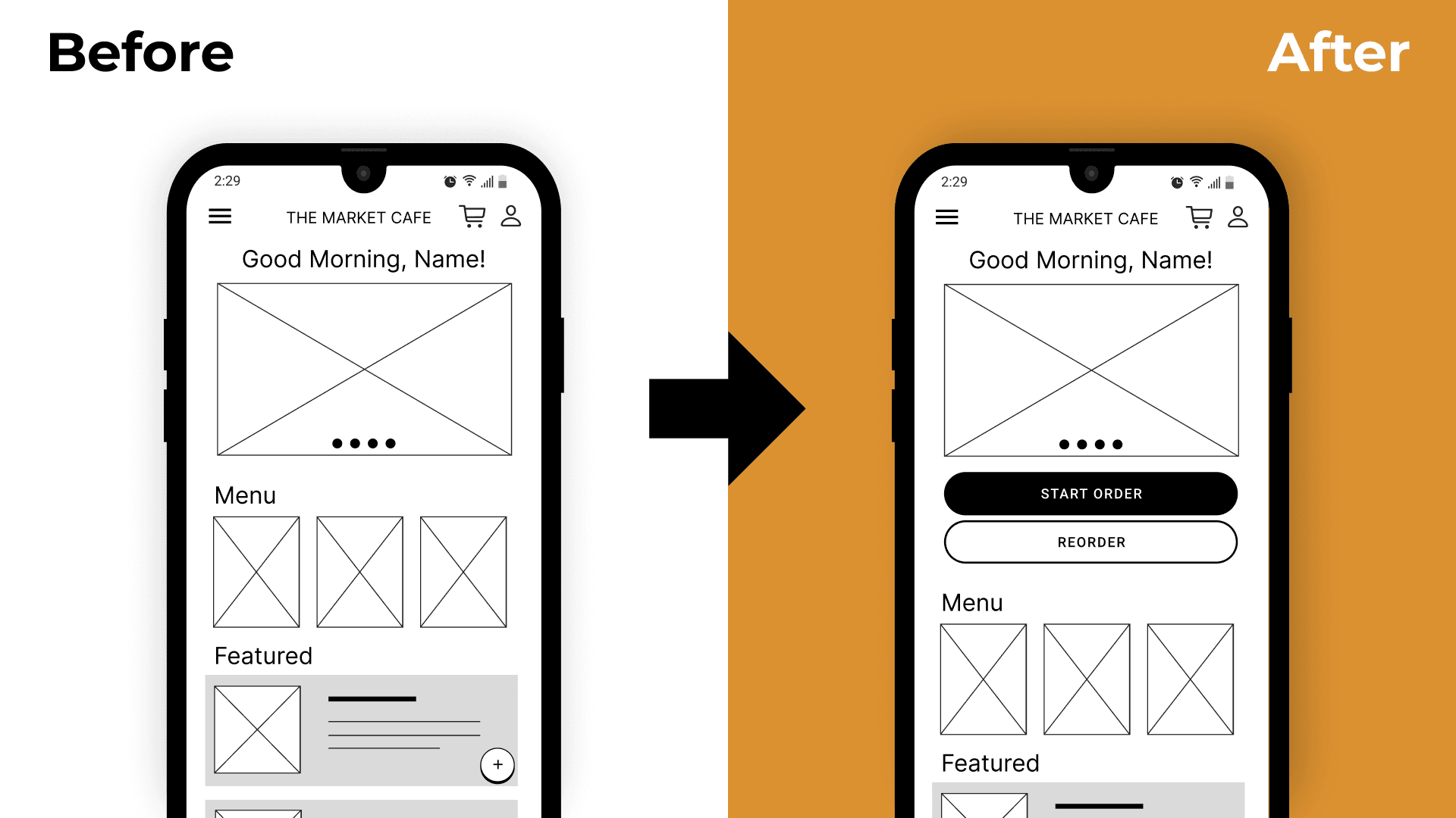


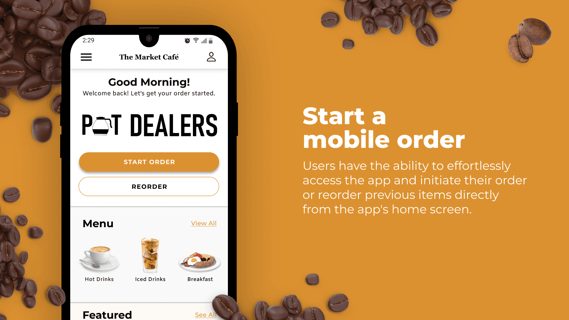
After the first usability test, I added a Start Order and Reorder button to the app's homepage. This addressed some confusion noted by two participants of the usability study, as the original wireframe lacked a central button to start an order. These buttons were strategically placed below the initial home screen banner to address this critique.
After the first usability test, I added a Start Order and Reorder button to the app's homepage. This addressed some confusion noted by two participants of the usability study, as the original wireframe lacked a central button to start an order. These buttons were strategically placed below the initial home screen banner to address this critique.
After the first usability test, I added a Start Order and Reorder button to the app's homepage. This addressed some confusion noted by two participants of the usability study, as the original wireframe lacked a central button to start an order. These buttons were strategically placed below the initial home screen banner to address this critique.
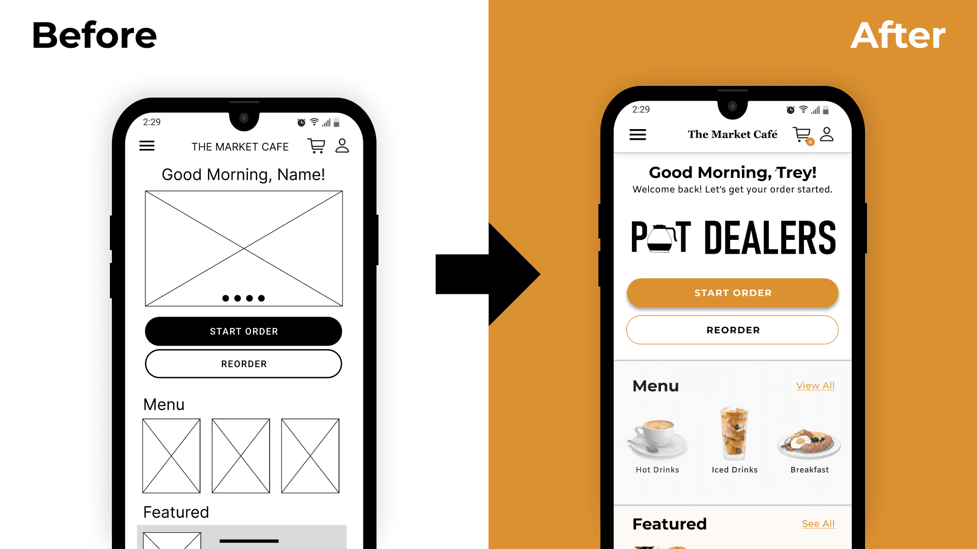


As you can see, the Start Order button is clearly visible, the button stretches the length of the page and is filled with the primary brand color, making it the most prominent button on the page.
As you can see, the Start Order button is clearly visible, the button stretches the length of the page and is filled with the primary brand color, making it the most prominent button on the page.
As you can see, the Start Order button is clearly visible, the button stretches the length of the page and is filled with the primary brand color, making it the most prominent button on the page.
Iteration #2: Revised pickup method buttons
Iteration #2: Revised pickup method buttons
Iteration #2: Revised pickup method buttons
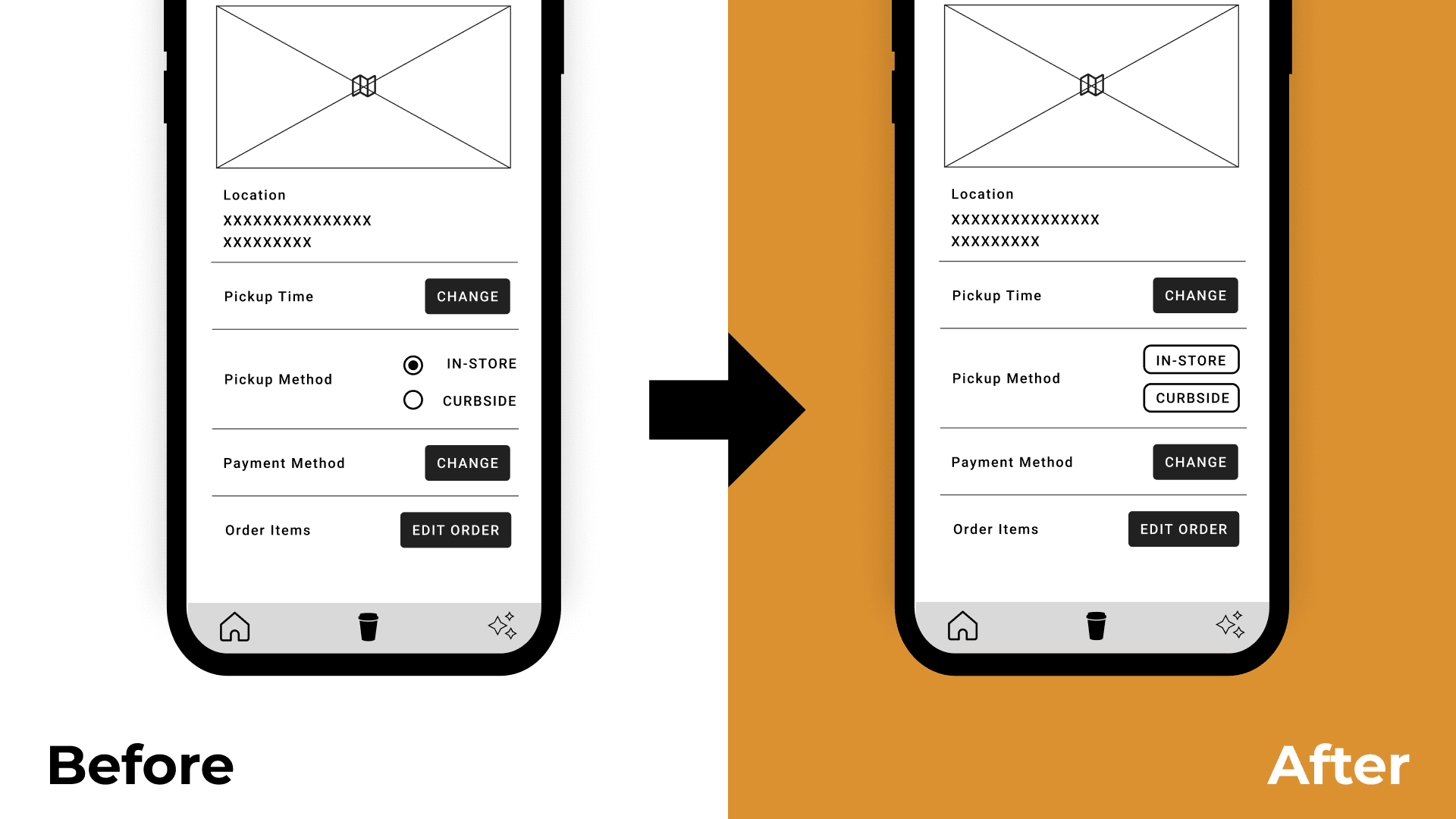


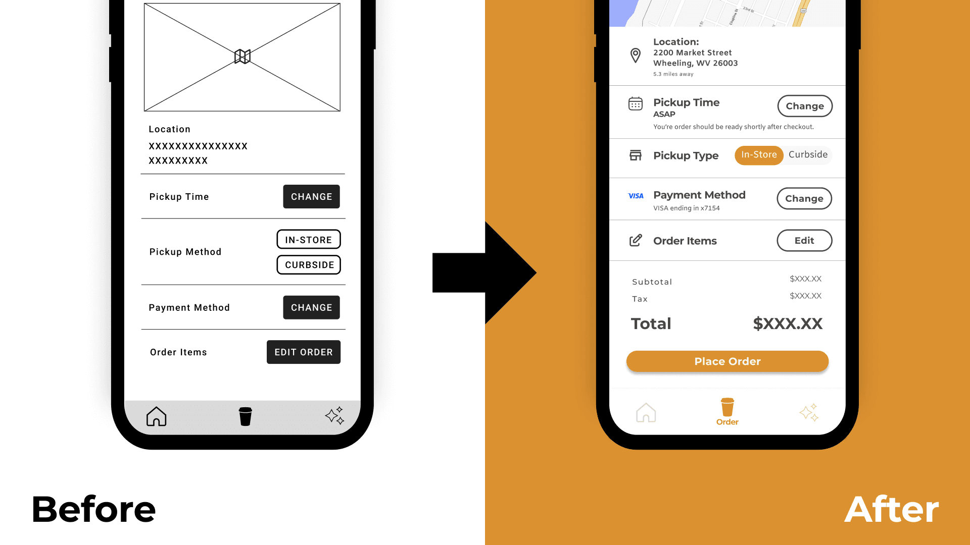
The next change was altering the pickup method option from a radio button to two buttons stacked on top of one another. This change was prompted by both visual discrepancies and user difficulty in selection, leading to the adoption of two buttons.
A more refined solution dawned on me during the creation of the initial mockup. While the two buttons improved the selection of pickup options, it became apparent that presenting the two choices side-by-side, rather than stacked, would enhance clarity. The optimal resolution was to introduce a segmented toggle button, affording users the ability to choose between the options seamlessly.


FINAL DESIGN
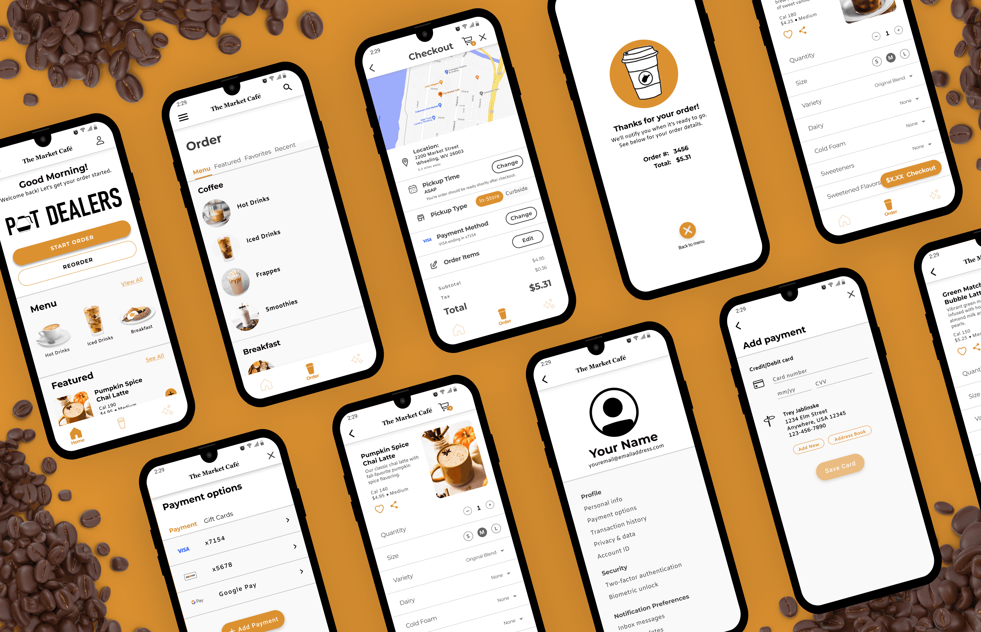
FINAL DESIGN
WHAT I LEARNED...
WHAT I LEARNED...
WHAT I LEARNED...
This is my first official UI/UX portfolio project! Needless to say, I learned a LOT about branding, wireframes, user research, design…the list goes on! Achieving the elusive "simplicity" in design proved more challenging than one might imagine. Much like seamless film editing, the best UI/UX is subtle; it goes unnoticed, and users don't question it—it simply works. The experience has heightened my observational skills, enabling me to articulate preferences and identify flaws in mobile apps I never paid much attention to before. By reverse engineering other apps, I incorporated the most effective elements and layouts that best fit the user flow I wanted.
This is my first official UI/UX portfolio project! Needless to say, I learned a LOT about branding, wireframes, user research, design…the list goes on! Achieving the elusive "simplicity" in design proved more challenging than one might imagine. Much like seamless film editing, the best UI/UX is subtle; it goes unnoticed, and users don't question it—it simply works. The experience has heightened my observational skills, enabling me to articulate preferences and identify flaws in mobile apps I never paid much attention to before. By reverse engineering other apps, I incorporated the most effective elements and layouts that best fit the user flow I wanted.
This is my first official UI/UX portfolio project! Needless to say, I learned a LOT about branding, wireframes, user research, design…the list goes on! Achieving the elusive "simplicity" in design proved more challenging than one might imagine. Much like seamless film editing, the best UI/UX is subtle; it goes unnoticed, and users don't question it—it simply works. The experience has heightened my observational skills, enabling me to articulate preferences and identify flaws in mobile apps I never paid much attention to before. By reverse engineering other apps, I incorporated the most effective elements and layouts that best fit the user flow I wanted.
